Creating Effective Landing and Thank You Pages on HubSpot: A Guide for Marketing Teams
- Home
- Creating Effective Landing and Thank You Pages on HubSpot: A Guide for Marketing Teams
Landing pages and thank you pages are crucial elements of your HubSpot lead generation strategy. They serve as a focused gateway for capturing lead information and then continuing the prospect's journey. As HubSpot solution providers, we've crafted this guide to walk you through creating high-converting landing and thank you pages within the HubSpot platform. We'll blend industry-backed principles with HubSpot-specific tools to enhance your results.
Outline
-
- Conceptual Principles: We'll break down the essential components of landing pages – strong headlines, compelling copy, effective visuals, and strategic form design. And don't forget the thank you page! We'll cover how to further engage visitors after form submission.
- HubSpot's Toolkit: You'll learn how to leverage HubSpot's templates, create customized designs, integrate smart forms for better data insights, and analyze results for continual conversion improvement.
- EEAT Considerations: This guide is authored by our in-house HubSpot experts, ensuring that the instructions reflect a deep understanding of best practices and the platform's capabilities.
Ready to optimize your lead generation on HubSpot? Follow our step-by-step instructions to start designing successful landing and thank you pages.
Let's get started!
Why Landing Pages and Thank You Pages Matter in Inbound Marketing
Key Points:
-
Focused Targeting:
- Unlike general website pages, landing pages directly match a specific campaign, ad, or content offer.
- This laser focus maximizes the potential for conversions by catering to a visitor's exact interest.
-
Frictionless Lead Capture:
- Landing pages strip away navigation and distractions, minimizing the risk of abandonment.
- High-value content is exchanged for user contact info – establishing the lead for nurturing.
- HubSpot can automatically create leads via smart form submissions.
-
Optimized Value Exchange:
- Both the landing page and offer must present clear benefits to the visitor.
- Compelling headlines and concise descriptions make them immediately clear.
- Forms strike a balance between necessary data fields and keeping things quick to encourage submission.
-
Segmented Nurturing:
- Landing page forms aren't one-size-fits-all, they enable visitor self-segmentation by interest.
- HubSpot workflows then nurture the lead with tailored content, moving them down the funnel.
-
Continued Engagement via Thank You Pages:
- They aren't a dead end – provide the promised download and further actions.
- This might be additional content links, social media follows, or a consultation prompt.
- HubSpot seamlessly redirects or displays "thank you" with options upon form completion.
-
Measuring & Refining:
- HubSpot’s analytics are tied to page performance – what keywords, demographics, etc., led to conversion.
- A/B testing variants of landing pages help fine-tune your efforts over time.
Example: Unbounce Landing Page
- Landing Page: Try Unbounce's "Essential Guide to Landing Pages":

Why is this a great design?
- Clear Headline & Subtext: Immediately states the offer and its value ("Build High-Converting Landing Pages").
- High-Contrast CTA: The orange "Get Your Free Copy Now" button stands out visually, making the desired action obvious.
- Eye-catching Image: The graphic isn't just decorative, it illustrates the concept – pages being successfully "built".
- Minimal Form: Reduces friction – they collect name, email, and company (just enough to qualify the lead).
- Social Proof: The "...trusted by over 15,000 brands" boosts credibility, a minor but powerful EEAT boost.
Follow the steps below to create your landing and thank you page.
Step 1: First you have to create the cover of the eBook, which will be used on the landing page. Therefore save the first page of the eBook as a jpg file.
Step 2: Download the eBook Cover Template, which you can find in the Attachments section.
Step 3: Open your Internet Browser and move to www.pixlr.com.
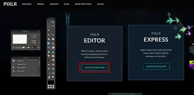
Step 4: Scroll down until you find the PIXLR Editor and click on LAUNCH WEB APP.
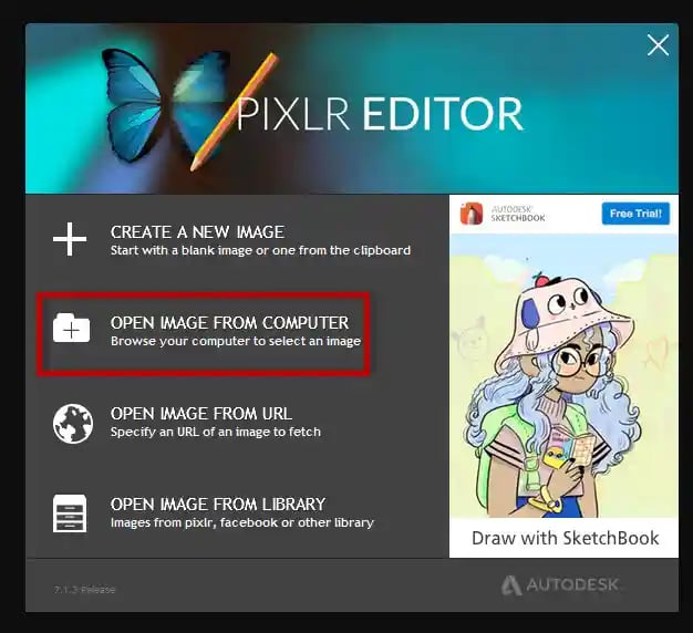
Step 5: Click on OPEN IMAGE FROM COMPUTER and select the eBook Cover Template.
Step 6: Now click on Layer and then Open Picture as a layer and select the first-page jpg file which you saved within Step 1 of Part 2.
Step 7: Click on Edit and then Free Distort... Try to move the corners of the layer picture to the corners of the background picture so that they fit.
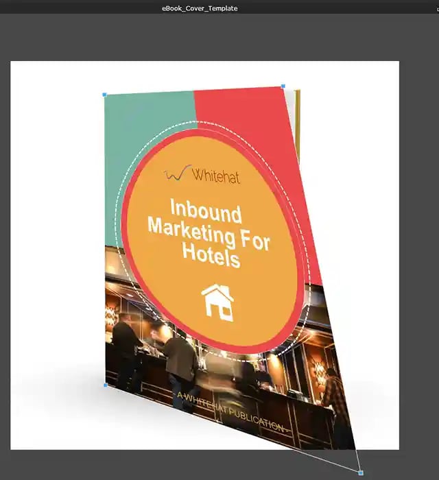
Step 8: After you are pleased with the new arrangement, please right-click on layer 2 and select Flatten image which will bring together the layer and the background.
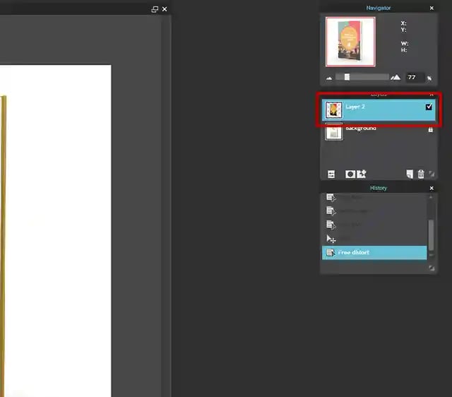
Step 9: After that, the cover is created and you can save it as a PNG or jpg file.
Step 10: Open your internet browser and move to the marketing dashboard on HubSpot:
Step 11: Click on Marketing, File & Templates in the navigation and then File and move into the folder Whitehat-eBooks.
Step 12: Upload the eBook cover and the eBook into this folder.
Step 13: Then click on Marketing, Websites and then on Landing Pages. Into the search field insert “Tips for a successful Inbound Marketing”. Which will give you two results.
Step 14: You can use those pages as templates for your new landing and thank you pages. Start with the thank you page, which has the acronym WH-AW-TYe. Move the cursor to the right side and move over the thank you page row. You will see a button which says Clone, push it.
Step 15: Change the title from WH-AW-TYe: Download Tips for a Successful Inbound Strategy (Clone) to WH-AW-TYe: Download Title of eBook
Step 16: You will be forwarded and can now edit the thank you page. Normally you just have to change five things on this page.
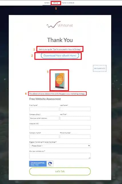
- Start with changing the headline.
- Exchange the link behind the "Download Your eBook Here!" button with the new one. The link, which needs to be inserted, can be found here (Marketing → Files and Templates → Files → “Whitehat eBooks” folder):

- Change the image cover.
- Change the description.
- Click on Settings and change the page title, the URL and the meta description.
Step 17: Save the page and then publish it.
Step 18: Redo Steps 12 and 13 but this time with the landing page, which has the acronym WH-AW-LPe.
Step 19: Again you will have to change 5 things on this page.
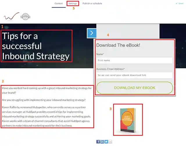
- Start with changing the headline.
- Change the description.
- Change the cover.
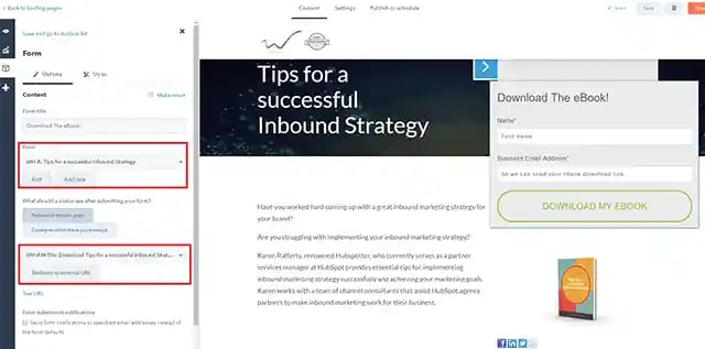
- Create a new form cloning the one named “WH-A: Tips for a successful Inbound Marketing”. To do this, in the general menu go to Contacts → Lists → Forms and search for it. Then clone it, naming it “WH-A: eBook name”. Now you can come back to the Landing Page and click on the form: a new window will open. Under “Form” choose the new one you have just created. Furthermore, change the redirection page by selecting your new thank you page. Click on save by using the button at the bottom. To be able to select your thank you page, you have to publish it first. Therefore we did the thank you page before.
5. Change the page title, the URL and the meta description.
Step 20: Save the landing page and publish it.
Conclusion: Mastering the HubSpot Landing & Thank You Page Dynamic
By now, you've learned the essential components of landing and thank you pages, how to build them within HubSpot, and why these focused assets are pivotal to inbound success. Remember, they aren't just a one-time setup; this is a process driven by ongoing optimization:
- Analyze Performance: Regularly review HubSpot's analytics – which offers led to the most conversions, where might visitors hesitate? Utilize this to pinpoint potential friction in your designs.
- Iterate & Experiment: Use A/B testing on elements like headline wording, imagery, or form length to uncover what resonates most effectively with your audience.
- Stay Current: Inbound marketing and HubSpot's own tools continually evolve. Refresh your pages to match current design trends and any changes in how HubSpot handles forms and data, keeping your strategies fresh.
Your Call to Action: If you're still feeling unsure about implementing specific steps or maximizing HubSpot's capabilities, don't hesitate to consider additional resources:
- Explore HubSpot's Knowledge Base: Their online documentation is robust, with specific sections on landing pages and form creation.
- Reach Out to Us: As your HubSpot solution partner, we're here to assist with targeted guidance, tailored consultations, and even complete page design setup.
Let's make your landing and thank you page lead generation powerhouses!
FAQ: Optimizing Your HubSpot Landing & Thank You Pages
Q: Can I design a landing page completely from scratch in HubSpot? A: Yes! While HubSpot provides templates, its drag-and-drop builder allows for extensive customization. You can start with a blank canvas if desired, ensuring your design perfectly aligns with your unique branding.
Q: My content offer is lengthy (e.g., a detailed whitepaper). Is a landing page still suitable? A: While landing pages thrive on brevity, long-form content can work. If your value proposition is strong, it might be worth it. Focus on a clear summary first, allowing visitors to download it immediately, then include additional detail further down the page if they choose to keep scrolling.
Q: How do I ensure our landing pages comply with privacy regulations like GDPR? A: HubSpot includes tools for privacy and consent management (cookie popups, checkboxes, etc.). Consult their documentation for the most up-to-date practices and any regional guidelines that apply to your business.
Q: Is there a limit to the number of landing pages I can create in HubSpot? A: This depends on your HubSpot subscription tier. Lower tiers generally have limits, while higher tiers may offer unlimited pages. Review your account limitations or contact HubSpot support for specifics.
Q: Can I create thank you pages without separate URLs, keeping visitors on the same page? A: Yes! HubSpot offers a "display a message" thank you option on forms, which replaces the form content with a confirmation message for a streamlined experience. However, a separate thank you page still presents benefits for offering further engagement opportunities.

