
Updated 5th June 2020
The internet is changing. While it was built around servers and personal computers, it is evolving into an amorphous network largely accessed through smartphones. Recent surveys find that the mobile web is growing and expected to take over the internet. How does this affect your website and your business, now and in the future?
The Facts about the Rise of the Mobile Web
Millions of people are coming online each year and many of them are doing so through cell phones, not desktop computers. The number of smartphones worldwide is projected to be around 3.5 billion by the end of 2020.

Many young people in developing nations are also using their cell phones to surf the web more than they are using desktop computers.
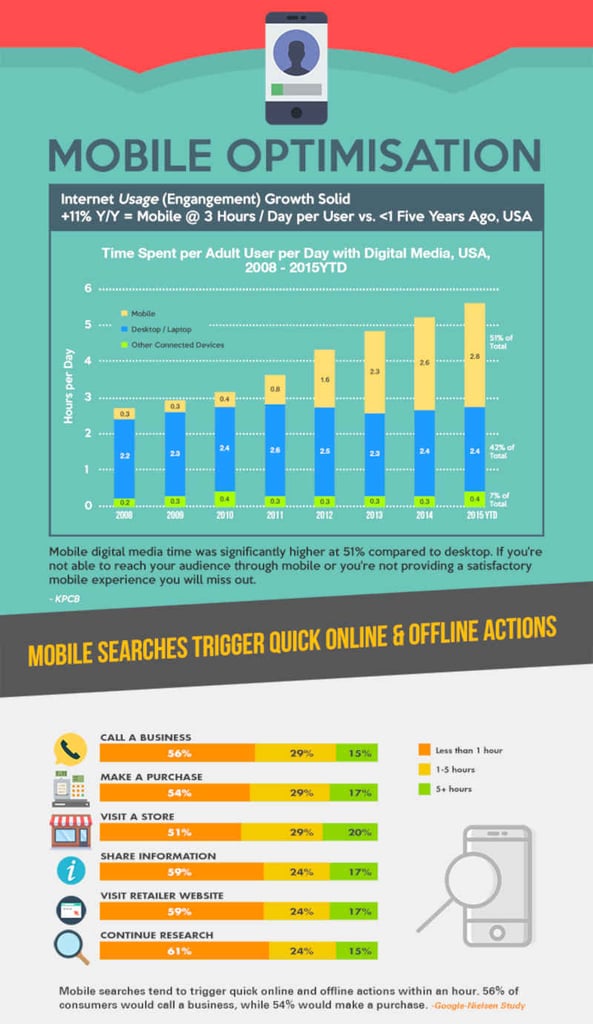
The company comScore has found that over 52 million Americans own tablets. 96% of American adults have smartphones, and smartphone purchases are growing more quickly than desktop PC purchases.
Those numbers are expected to grow as millions upgrade their cell phones to smartphones over the next few years. Smartphones are the default offering when young adults purchase their first phone.
This means that mobile internet users exceed the number of desktop users by a large margin.
How This Affects Your Business
If your website has not been optimised for mobile users, you’ll lose out on a lot of your potential customers. And the lost business opportunities are only expected to grow with time.
A Sterling Research survey found that 52% of users won’t use a website that has a bad mobile experience, and most of them don't bother to come back later when they have access to a PC.
Mobile-friendly websites increase sales. Those using mobile devices are more likely to be in your geographic area looking for your products or services when they search.
Even if they are going to buy the product online, two-thirds of those surveyed say they are more likely to buy something from a site if it's mobile-friendly.
Mobile internet usage is growing as literally billions of young people use web searches for everything from quick background checks of people they just met to finding a good Chinese restaurant for lunch.
Mobile Website Configurations
Google already supports mobile websites and the search engine prefers mobile responsive configurations. It supports dynamic serving and the mobile version website, but Google doesn’t recommend using them.
Let’s look at how these three mobile website configurations work:
Dynamic serving uses the same URL for mobile and desktop computers but delivers different sites based on the type of device.
HTML is typically delivered to websites viewed on a PC, while CSS is provided to mobile devices. To use dynamic serving, programmers either have to develop different code for mobile website delivery or use JavaScript to convert the code.
Website administrators need to be careful of how they manage dynamic serving, because Google crawlers may not properly index dynamic HTML sites.
Mobile versions of a website often have an 'm' in front of the website name to indicate that it is a mobile website. For example, example.com becomes m.example.com.
Mobile websites introduce several risks. Sites like Reddit and others recommend against clicking on mobile website links due to the security risk. This is because mobile websites typically require redirection to work and Google doesn’t always redirect sites properly. Furthermore, mobile websites have to be indexed and optimised for Google.

Mobile responsive sites however deliver the same website to the user’s device. Responsive web design is Google’s recommended mobile website design. Google likes responsive web design because it indexes and ranks more quickly.
In responsive web design, the site uses the same URL for both mobile and PC visitors. Mobile visitors can see the site because CSS alters how the site is rendered on the smartphone.
Mobile responsive websites only need to be indexed once by Google’s algorithms. System administrators, ' job is simpler because they only have to build and maintain one site. And only one site has to be optimised for the search engine.
Website administrators may want to implement server-side components to deliver websites more quickly through cell phone networks than relying on device-side solutions.
Learn more about Growth Driven Web Design
An Overview of the Mobile Responsive Website
What makes a website mobile responsive? First, it has a flexible grid, also called a fluid grid. The flexible or fluid grid allows the website to be resized to display properly for the screen on which it is being viewed. Secondly, it has flexible images. Graphics are properly resized for smaller screens. And third, mobile responsive websites use CSS3 media queries.
When all of these elements are in place, content will shift to optimise the display while ensuring that graphics don’t crowd out content.
These elements can also be used to alter the content delivered, such as eliminating slideshows of your products when the site is opened on a smartphone. Meanwhile, someone looking for a place to have dinner will be shown menus, hours of operation and similar relevant information.
Why a Mobile Website is More Important than an App
Many companies have made the mistake of assuming that they need an app to reach customers. An app may lead to greater sales and better customer loyalty through delivering coupon codes and deals. However, mobile website users are unlikely to stay on a website that isn’t mobile-friendly, much less download your app.

Why Mobile Responsive Websites are Critical in Today’s Environment
- Accessibility: Mobile responsive websites make your website immediately accessible and appreciated by mobile viewers. This will lead to more visitors who in turn are more likely to purchase goods and services.
- Crawlability: Websites set up with the mobile responsive configuration are more easily picked up by Google’s crawlers. Website redirects won’t hurt your Google rankings.
- Single site: Mobile websites have an advantage when it comes to marketing. A single website can be used in social media marketing, equally accessible to mobile and PC viewers. There’s no need to promote two separate URLs. Mobile websites will retain mobile visitors, and you’ll capture customers who flee non-responsive websites built by your competitors.
Developing a single mobile responsive website means you only have to build and maintain a single website. However, you need to be sure to test it on both PCs and mobile devices before declaring it ready for prime time.
- Mobile web surfing is the future: Making the shift to mobile responsive web design now will improve market share today and avoid the hassle of making the change later.
- Mobile responsive websites are preferred by Google over other website configurations: And sites that shift to mobile responsive will get better search engine rankings than those that ignore Google’s preferences, which should be taken as a mandate by all smart business owners.
Follow the link to learn about our responsive web design services and how important SEO web design is for generating traffic to your site.
Send us an email at info@whitehat-seo.co.uk or call us at +44 20 8834 4795 now to see how you can avail of our free in-depth consultation… so we can make your website and business mobile responsive, customer friendly, and ready for the future.
