Maximise Impact with Colour Psychology Web Design Strategies
- Home
- Maximise Impact with Colour Psychology Web Design Strategies
In the realm of Colour Psychology Web Design, understanding the emotional and psychological impact of colours is crucial for creating a user experience that aligns with your brand's message. The choice of a website’s colour scheme can evoke specific moods, raise emotions, and even influence purchasing decisions among site visitors.
This comprehensive guide delves into the fascinating world of colour psychology in web design to help you make informed choices when selecting hues for your online presence. We will explore how different colours elicit emotional responses and cultural associations, from red's urgency and excitement to blue's trustworthiness and stability.
Additionally, we'll examine successful implementations of various colours such as white for purity and simplicity or black for sophistication and power. Furthermore, we'll discuss strategies like using Canvas Colour Wheel to gain insights into target audience preferences while designing custom colour schemes tailored specifically to their tastes.
By mastering the principles behind Colour Psychology Web Design, you can craft visually appealing websites that resonate with your intended audience on both an aesthetic level as well as subconsciously through their cultural background.
Table of Contents:
- The Impact of Colour Psychology on Web Design
- Emotional Responses to Various Colours
- Cultural Associations with Specific Hues
- Red - Urgency and Excitement
- Blue - Trustworthiness and Stability
- White - Purity and Simplicity
- Black - Sophistication and Power
- Yellow - Cheerfulness and Optimism
- Green - Healthiness and Environmental Consciousness
- Using Canva's Colour Wheel for Target Audience Insights
- FAQs in Relation to Colour Psychology Web Design
- Conclusion
The Impact of Colour Psychology on Web Design
Colour psychology plays a significant role in web design, as it can evoke emotions and influence user behaviour. By understanding the effects of different colours on users' perceptions and actions, designers can create websites that drive engagement and increase conversions. In this section, we will explore emotional responses to various colours and cultural associations with specific hues.
Emotional Responses to Various Colours
Different colours elicit distinct emotional reactions from people. For example, red is often associated with excitement or urgency, while blue conveys feelings of trustworthiness and stability. Understanding these associations allows designers to strategically use colour schemes that align with their website's goals.
- Red: Excitement, urgency, passion
- Blue: Trustworthiness, stability, calmness
- Yellow: Happiness, optimism, warmth
- Green: Healthiness, environmental consciousness, nature-inspired themes
Cultural Associations with Specific Hues
In addition to evoking emotions based on psychological factors, certain colours carry unique meanings across various cultures which may impact how they are perceived by diverse audiences online. Here are some examples:
- In Western culture, white symbolizes purity and innocence, whereas black represents darkness and death (yet within digital spaces signifies sophistication and power).
- In Eastern cultures, red typically denotes happiness and prosperity, making it a popular choice during celebrations such as Chinese New Year.
- Blue is universally recognized as a symbol of trustworthiness and stability; however, it is also associated with mourning in Iran (demonstrating the importance of considering cultural context when designing websites).
To create an engaging and effective website design that resonates with your target audience, it's crucial to consider both the emotional responses and cultural associations tied to different colours. For maximum impact, you should consider the emotional responses and cultural associations of colours when designing a website to ensure it resonates with your target audience.
The Impact of Colour Psychology on Web Design is a powerful tool that can be used to create an emotional response in users and guide their experience. By understanding the cultural associations with specific hues, designers can use red strategically to evoke urgency or excitement while avoiding overwhelming visitors.
Understanding the impact of colour psychology on web design is crucial for driving engagement and increasing conversions. Different colours elicit distinct emotional responses from people, while certain hues carry unique meanings across various cultures that may impact how they are perceived by diverse audiences online. By considering both emotional responses and cultural associations tied to different colours, designers can create an engaging and effective website design that resonates with their target audience.
Red - Urgency and Excitement
The colour red is known for conveying a sense of urgency, making it ideal for call-to-action buttons or limited-time offers. Its association with excitement also makes it an excellent choice for highlighting important information or creating a sense of energy within your website's design. By understanding the effects of red on users' emotions and actions, you can harness its power to drive engagement and increase conversions.
Examples of Effective Use of Red in Web Design
- Netflix: The popular streaming service uses red as its primary brand colour, creating a bold visual identity that stands out from competitors while emphasizing the excitement associated with watching movies and TV shows.
- Coca-Cola: This iconic beverage company utilizes red throughout their website to evoke feelings of happiness and refreshment, reinforcing its long-standing brand image.
- Virgin Media: As part of the Virgin Group, Virgin Media incorporates bright red into its web design to create a sense of urgency around special offers while maintaining consistency with other companies under the same umbrella.
Balancing Red with Other Colours to Avoid Overwhelming Users
While using red effectively can boost user engagement, overdoing it may lead to negative consequences such as causing anxiety or overwhelming visitors. To avoid these pitfalls:
- Pair red with neutral colours like white or grey: These combinations help balance out the intensity without diluting the impact of red.
- Use red sparingly: Limit the use of red to specific elements such as call-to-action buttons, headlines, or key messages. This ensures that users are drawn to these critical areas without feeling overwhelmed by an excess of bold colour.
- Consider your target audience's cultural associations with red: In some cultures, like China, red is considered a lucky and auspicious colour; however, in others, it may symbolize danger or aggression. Understanding your audience's perceptions can help you make informed decisions about how much and where to incorporate this powerful hue.
Incorporating the colour red into your web design can be highly effective when used strategically for driving engagement and conversions. By understanding its psychological effects on users' emotions and actions while balancing its intensity with complementary colours, you can create a visually appealing website that resonates with your target audience.
Red can be used to create a sense of urgency and excitement in web design, but it should always be balanced with other colours to avoid overwhelming users. To ensure trustworthiness and stability in your designs, consider using shades of blue that work together for maximum impact.
Red is a powerful colour that can convey urgency and excitement, making it an excellent choice for call-to-action buttons or highlighting important information on your website. However, using too much red can be overwhelming to users, so it's essential to balance its intensity with neutral colours and consider cultural associations with the colour. Effective use of red in web design can drive engagement and increase conversions if used strategically.
Blue - Trustworthiness and Stability
The colour blue is often associated with dependability, intelligence, trust, safety, and security. This makes it an ideal choice for businesses looking to establish credibility online. Incorporating blue into your website's design can help convey these qualities while providing a calming effect on visitors.
Successful Brands Using Blue in Their Designs
Many well-known brands utilize the power of blue in their web designs to evoke feelings of trust and stability. For example, Facebook, LinkedIn, and PayPal all prominently feature shades of blue throughout their websites. These companies understand that using this colour effectively helps them build trust with users who may be sharing sensitive information or conducting financial transactions through their platforms.
Combining Shades of Blue for Maximum Impact
To make the most out of incorporating blue into your web design strategy, consider combining various shades to create visual interest without sacrificing consistency or readability. Lighter blues like sky or baby blue can work well as background colours while darker tones such as navy or midnight provide contrast when used for text elements:
- Sky Blue: A light shade perfect for backgrounds that promotes calmness and tranquillity.
- Baby Blue: Another light option which evokes feelings of innocence and serenity within viewers.
- Navy Blue: A deeper hue offering sophistication; ideal when paired alongside lighter counterparts (e.g., headers/footers).
- Midnight Blue: An almost-black variant suitable primarily towards text-based content ensuring legibility against paler backdrops.
When selecting the right shades of blue for your website, it's essential to consider not only their emotional impact but also how they'll work together visually. By using a colour wheel, you can identify complementary colours that will enhance your design and create harmony across all elements on the page.
Incorporating blue into your web design is an effective way to convey trustworthiness and stability while creating a calming atmosphere for visitors. By understanding successful examples from established brands and experimenting with various shades, you can craft a unique online presence that resonates with your target audience and supports your business goals.
Blue is a great choice for creating trust and stability in web design, as its calming effects can help create an environment of assurance. White offers many advantages to web designs by providing a clean backdrop that allows the other elements on the page to stand out more clearly.
Incorporating shades of blue into your web design can convey trustworthiness, and stability and create a calming atmosphere for visitors. Successful brands like Facebook, LinkedIn, and PayPal utilize various shades of blue to evoke feelings of dependability and security. When selecting the right shades of blue for your website, consider combining them to create visual interest without sacrificing consistency or readability while using a colour wheel to identify complementary colours that will enhance your design.
White - Purity and Simplicity
In Western culture, white represents innocence, virtue, and purity which lends itself well to minimalist web designs seeking clarity or simplicity. Using white space effectively allows content to breathe while directing focus towards essential elements such as text or images. In this section, we will explore the benefits of incorporating white space into web layouts and techniques for achieving clean designs using white.
Benefits of Incorporating White Space into Web Layouts
- Improved readability: Generous use of white space can enhance the legibility of your website's text by reducing visual clutter and allowing users to focus on the content.
- Better user experience: A clean design with ample white space can make it easier for visitors to navigate your site and find what they're looking for quickly.
- Aesthetic appeal: Minimalist designs featuring plenty of white tend to look modern and professional, creating a positive impression on potential customers.
- Increase in conversions: By strategically placing call-to-action buttons within areas surrounded by whitespace, you can draw attention to them more effectively than if they were competing with other elements on the page.
Techniques for Achieving Clean Designs Using White
- Selecting appropriate fonts: To maintain a crisp appearance throughout your website's design, choose simple sans-serif typefaces like Arial or Helvetica that are easy on the eyes when set against lighter backgrounds.
- Create contrast with colour: To prevent monotony within your minimalist design, introduce subtle splashes of colour that complement the predominantly white palette. This can be achieved through the use of colour psychology to evoke specific emotions or associations related to your brand.
- Utilize grids and alignment: Implementing a grid system for organizing content within your layout will ensure consistency across different sections/pages while also providing structure amidst vast expanses of whitespace.
- Balancing visual elements: Be mindful not to overcrowd certain areas with images or text; instead, distribute these components evenly throughout the page so as not to overwhelm users.
White space should be utilized in web design to create a pleasant, navigable experience for users. By understanding its benefits and employing various techniques, you can craft a visually appealing website that effectively communicates your message while remaining true to the principles of purity and simplicity associated with this versatile hue.
White is a classic colour that conveys purity and simplicity, making it an ideal choice for web design. With its power to evoke sophistication and strength, black can be used as the perfect contrast when paired with white in any website layout.
Incorporating white space into web design can enhance readability, improve user experience, increase conversions and add aesthetic appeal. Techniques for achieving clean designs using white include selecting appropriate fonts, creating contrast with colour, utilizing grids and alignment and balancing visual elements. By understanding the benefits of incorporating white space and employing various techniques, a visually appealing website that effectively communicates your message can be crafted while remaining true to the principles of purity and simplicity associated with this versatile hue.
Black - Sophistication and Power
Although black may denote darkness or death across many cultures, its usage within digital spaces signifies sophistication and power when employed strategically alongside contrasting colours like gold or silver accents for luxury branding. Furthermore, this versatile hue adds depth and contrast against lighter backgrounds while maintaining legibility through text-based content.
Examples of Black in High-End Web Design
Black can be utilized to impart an aura of sophistication and exclusivity when it comes to high-end web design. For instance, Apple's website employs a sleek black background with white text to create an aesthetically pleasing user experience that exudes sophistication. Similarly, luxury fashion brands such as Gucci and Prada utilize black as their primary colour scheme to showcase their products in an upscale manner.
Balancing the Use of Black with Other Colours
To avoid overwhelming users with too much black on your website, it's essential to balance it out with other complementary colours. Here are some tips for achieving harmony:
- Mixing shades: Combine different shades of grey or off-black hues (such as charcoal) to soften the overall appearance without sacrificing elegance.
- Add pops of colour: Introduce small bursts of vibrant colours like reds or blues through buttons, icons, or images which can break up large areas dominated by darker tones whilst still maintaining visual interest and cohesion throughout your site's layout/design elements.
- Select suitable contrasts: Pair black with lighter colours like white or pastels to create a visually appealing contrast that enhances readability and directs users' attention towards key content pieces on your site.
By incorporating black into your web design thoughtfully, you can successfully convey an air of sophistication and power while ensuring a positive user experience. To achieve this balance, consider the examples provided above as the inspiration for how to use black effectively in combination with other complementary hues within your website's overall aesthetic. And remember, tools such as Canva's colour wheel can help you explore different colour combinations tailored specifically towards your target audience preferences.
Darkness can be employed to bring a touch of sophistication and gracefulness to web designs. However, it must be balanced with other colours in order for the design to have maximum impact. Next, we'll explore how yellow can bring cheerfulness and optimism into your website's aesthetic.
Black is a versatile hue that signifies sophistication and power when used strategically in web design. It adds depth and contrasts against lighter backgrounds while maintaining legibility through text-based content. To achieve balance, mix shades of grey or off-black hues, add pops of colour and select suitable contrasts to create an aesthetically pleasing user experience that exudes elegance and exclusivity.
Yellow - Cheerfulness and Optimism
The colour yellow is known for its ability to evoke feelings of happiness, optimism, and warmth. Incorporating yellow into your website's design can create an inviting atmosphere for visitors while encouraging positive emotions, which may lead to increased engagement or conversions. In this section, we will explore successful implementations of yellow in web designs and discuss how pairing yellow with complementary colours can enhance the overall user experience.
Successful Implementations of Yellow in Web Designs
A number of well-known brands have effectively used yellow in their web designs to convey a sense of cheerfulness and positivity. For example, McDonald's, a global fast-food chain, uses vibrant shades of yellow throughout its website to communicate energy and excitement around its products. Similarly, Snapchat, a popular social media platform, employs bright yellows as part of its logo and interface design elements that reflect the app's fun nature.
- National Geographic: The iconic publication utilizes bold yellows within headings and accents across site pages, highlighting engaging content while remaining true to brand identity (National Geographic Website)
- IKEA: This Swedish furniture retailer showcases pops of yellow amongst minimalist layouts, creating visual interest without overwhelming users browsing through vast product offerings (IKEA Classic Club UK Website)
Pairing Yellow with Complementary colours
When incorporating yellow into your website's design, it is essential to consider the colours you pair with it. Complementary colours can help balance out the intensity of yellow and create a harmonious visual experience for users. Some popular colour combinations include:
- Yellow and Gray: The contrast between bright yellows and neutral greys results in an elegant, modern aesthetic that appeals across various industries (Yellow and Gray Website)
- Yellow and Blue: Combining warm yellows alongside cool blues generates vibrant contrasts while maintaining readability through text-based content (Yellow Blue Organization Website)
- Yellow and Green: Pairing shades of green with yellow creates naturalistic palettes evoking feelings associated with eco-friendly or health-conscious environments (YG Insider Blog)
Incorporating cheerful hues like yellow within web designs ultimately contributes towards positive user experiences leading to higher engagement rates online.
Yellow is a colour that can be used to bring cheerfulness and optimism into web designs, but it should always be balanced with complementary colours for the best visual impact. Green is often associated with healthiness and environmental consciousness, making it an ideal choice for brands looking to promote their eco-friendly initiatives.
Incorporating yellow into web design can create a cheerful and inviting atmosphere for visitors, leading to increased engagement or conversions. Successful implementations of yellow in web designs include McDonald's and Snapchat while pairing it with complementary colours like grey, blue, or green can balance out its intensity and create a harmonious visual experience for users.
Green - Healthiness and Environmental Consciousness
Green is often associated with health, nature, and environmental consciousness. Utilizing green within your website's design can effectively convey these values while promoting feelings of liveliness and contentment among users who visit your site seeking eco-friendly solutions, products, or services.
Brands using green to promote their environmentally friendly initiatives
Incorporating green into web designs has been a successful strategy for many brands that want to emphasize their commitment to sustainability and the environment. For example, Patagonia, an outdoor clothing company known for its eco-conscious practices, uses various shades of green throughout its website as a visual representation of its dedication towards preserving our planet. Similarly, Ecover, a brand offering plant-based cleaning products, features vibrant greens in both background images and text elements on its site to reinforce their environmentally friendly mission.
Blending shades of green for visual harmony
To create visually appealing websites that incorporate the colour green effectively without overwhelming visitors or causing distraction from essential information or content, it is crucial for designers to understand how different shades work together harmoniously within digital spaces:
- Pastel Greens: Soft pastel greens evoke feelings of tranquillity and relaxation, making them ideal choices when designing sites focused on wellness or spirituality (e.g., yoga studios).
- Vibrant Greens: Brighter hues like lime or forest greens are perfect options if you're looking to capture attention through bold visuals while still maintaining associations linked directly back to nature or environmentalism.
- Muted Greens: Muted greens such as olive or sage provide subtler alternatives that blend seamlessly alongside other colours (e.g., beige or brown) without overpowering surrounding elements within web layouts.
By carefully selecting appropriate shades of green and combining them effectively, designers can create visually striking websites that not only convey a brand's eco-friendly values but also enhance the user experience by promoting feelings of contentment and connection with nature. To ensure your colour choices align well together, consider using tools like Canva's colour Wheel to generate harmonious palettes based on your chosen hues.
Green is an incredibly powerful colour to use in web design, as it communicates healthiness and environmental consciousness. By understanding how the colours interact on Canva's Colour Wheel, you can create custom colour schemes tailored to your target audience's preferences.
Incorporating green into web designs can effectively convey values of health, nature, and environmental consciousness. Brands like Patagonia and Ecover use different shades of green to promote their eco-friendly initiatives. Designers should carefully select appropriate shades of green that blend seamlessly with other colours to create visually striking websites that enhance the user experience by promoting feelings of contentment and connection with nature.
Using Canva's Colour Wheel for Target Audience Insights
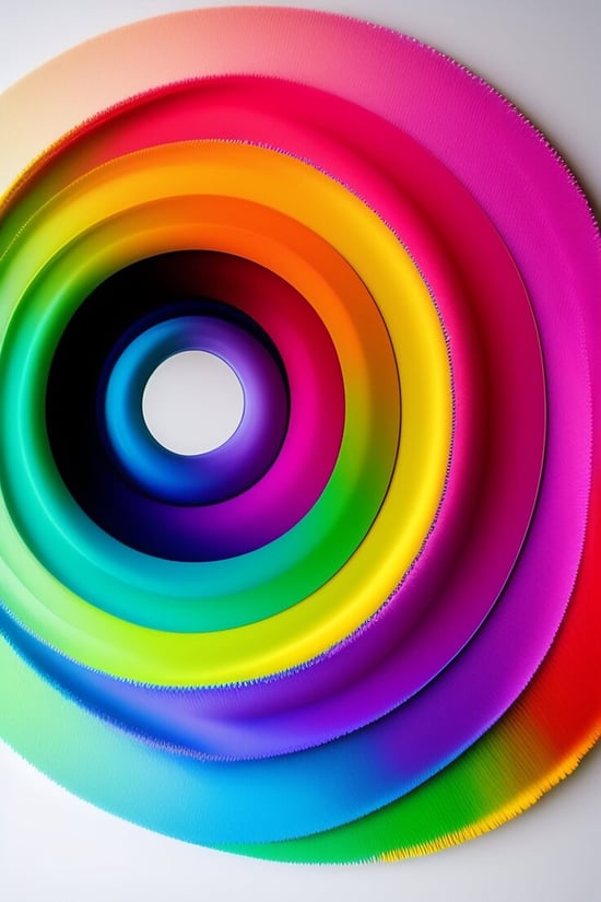
Although colour psychology remains generalized, tools like Canva's Colour Wheel offer valuable insights when tailoring designs towards specific target audiences. By providing harmonious palettes based upon chosen hues, you can increase overall user satisfaction and ultimately achieve higher conversion rates online.
Understanding Primary, Secondary, and Tertiary colour Relationships on the Wheel
The Canva Colour Wheel is divided into three categories: primary colours (red, blue, yellow), secondary colours (green, orange, purple) formed by mixing two primary colours together; and tertiary colours created by combining a primary colour with its adjacent secondary colour. Understanding these relationships allows designers to create balanced colour schemes that evoke desired emotions while maintaining visual harmony.
- Primary colours: Red - Urgency & Excitement; Blue - Trustworthiness & Stability; Yellow - Cheerfulness & Optimism
- Secondary colours: Green - Healthiness & Environmental Consciousness; Orange - Energy & Creativity; Purple - Luxury & Sophistication
- Tertiary colours: Examples include teal (blue-green), coral (orange-red), or chartreuse (yellow-green)
Creating Custom colour schemes Tailored to Audience Preferences
To develop an effective custom colour scheme using Canva's Colour Wheel tool:
- Select your base hue from the wheel as it represents the dominant emotion or message you want to convey through your design.
- Determine whether a complementary (e.g., red/green or blue/orange), analogous (e.g., red/orange/yellow or blue/green/purple), or triadic (e.g., red/blue/yellow or green/orange/purple) colour scheme best suits your target audience's preferences and the overall tone of your website.
- Adjust the saturation, brightness, and contrast levels to create a visually appealing palette that aligns with your brand identity while maintaining legibility for text-based content.
- Test various combinations on different devices/screens to ensure consistency across platforms before finalizing your design choices.
Incorporating insights from Canva's Colour Wheel into your web design process can help you better understand how specific colours influence user behaviour. By creating custom colour schemes tailored to their preferences, you'll be well-equipped to drive engagement and increase conversions through the strategic use of colour psychology in web design.
Canva's Colour Wheel offers valuable insights for tailoring designs towards specific target audiences, helping to increase overall user satisfaction and achieve higher conversion rates online. Understanding primary, secondary, and tertiary colour relationships on the wheel allows designers to create balanced colour schemes that evoke desired emotions while maintaining visual harmony. Creating custom colour schemes tailored to audience preferences can help drive engagement and increase conversions through strategic use of colour psychology in web design.
FAQs in Relation to Colour Psychology Web Design
What is colour psychology in web design?
Colour psychology in web design refers to the study of how colours evoke emotions, influence perceptions, and impact user behaviour. By understanding these effects, designers can create visually appealing websites that effectively communicate a brand's message and encourage desired actions from users. Learn more about colour psychology here.
How do colours affect web design?
colours play a significant role in shaping user experience on websites. They help establish visual hierarchy, draw attention to important elements, convey mood or tone, and reinforce branding identity. Different colours can trigger specific emotional responses from users which may influence their decision-making process while interacting with your website.
How is colour psychology used in graphic design?
In graphic design, colour psychology helps designers choose appropriate hues for various elements like logos, icons, typography, and backgrounds based on the intended message or emotion they want to convey. This involves considering cultural associations with certain colours as well as individual preferences among target audiences. Explore different meanings of colours here.
What is colour psychology in UI design?
Colour psychology plays an essential role in User Interface (UI) Design by guiding designers' choices when selecting shades for buttons, navigation menus, or other interactive components within digital interfaces such as apps or websites. A well-chosen palette enhances usability by making it easier for users to understand the content hierarchy and perform tasks efficiently.
Conclusion
In conclusion, understanding the impact of colour psychology on web design is crucial for creating effective and engaging websites. By using specific colours strategically, businesses can evoke emotional responses from their target audience and build trust in their brand. From red's urgency to blue's stability, white's simplicity to black's sophistication, and yellow's cheerfulness to green's environmental consciousness - each hue has its own unique associations that can be leveraged in web design.
By utilizing tools like Canva's colour wheel and tailoring custom colour schemes to audience preferences, businesses can create visually appealing designs that resonate with their customers. Incorporating these principles into your website's colour scheme can help raise emotions and improve user experience.
If you're looking for expert guidance on implementing colour psychology in your web design strategy, contact Whitehat Agency today!
Other relevant Blog posts
Responsive Web Design Makes Your Website Mobile and Customer Friendly
Inbound Marketing: CONVERT - Calls To Action

Next Steps
Now we would like to hear from you:
What colour have you chosen for your website? And why? Let us know by leaving a comment below right now.


