Remember when a simple "Click Here" button was enough to drive action? Those days are long gone! In today's AI-powered digital landscape, Call-to-Action (CTA) strategies have evolved into sophisticated, personalised experiences that can make or break your conversion rates.
Our latest research reveals some fascinating insights: personalised CTAs are outperforming generic ones by over 200%, and AI is revolutionising how we approach user engagement. Whether you're a seasoned marketer or just starting to optimise your website, understanding modern CTA best practices isn't just helpful—it's essential for survival in the digital jungle.

Let's dive into the game-changing strategies that are helping businesses transform their click-through rates, backed by fresh data and real-world success stories. From mobile-first design principles to AI-powered personalisation, we're about to explore how CTAs have evolved and, more importantly, how you can leverage these changes to drive real results for your business.
Ready to revolutionise your CTAs and boost your conversion rates? Let's break down what's working in 2025 and beyond!
💡 Pro Tip: By the end of this article, you'll understand exactly why that "Submit" button might be costing you valuable leads—and what to do about it.
MODERN CTA STRATEGY & BEST PRACTICES FOR 2025 AND BEYOND

In today's digital world, where capturing user attention is more challenging than ever, a well-crafted call to action (CTA) is crucial for converting visitors into customers. Engaging customers effectively can provide numerous benefits that directly impact the bottom line. When customers feel valued and heard, they're more likely to buy again—and spend more when they do1. Engaging your customers also helps differentiate your brand, stand out from the competition, and establish a loyal customer base that will continue to support your business over time1. This report goes deep into modern CTA strategies and best practices for 2025 and beyond, providing actionable insights to elevate your conversion rates and drive business growth.
THE EVOLVING LANDSCAPE OF CTAS
As we approach 2025, several factors are shaping the landscape of CTAs:
- Mobile-First Indexing: With most internet traffic coming from mobile devices, optimizing CTAs for mobile responsiveness is paramount. This includes ensuring buttons are easily tappable, text is readable, and loading speeds are optimized. By the end of 2025, there will be 7.49 billion mobile users worldwide, making mobile optimization a continuous trend234.
- The Rise of AI and Personalization: AI is revolutionizing how we design and implement CTAs. AI-powered tools can analyze user behavior, predict preferences, and personalize CTAs in real-time, leading to higher engagement and conversion rates567.
- Interactive Experiences: Interactive CTAs, such as quizzes, polls, and interactive content, are gaining traction7. These elements engage users and provide valuable data for further personalization.
- Video CTAs: Incorporating video into CTAs can be highly effective7. Video content can captivate users and prompt action when used strategically.
A/B TESTING AND OPTIMIZATION
Continuous A/B testing is crucial for optimising CTA performance. AI is increasingly being used to enhance A/B testing by analysing user behaviour and providing data-driven insights to improve CTA effectiveness8. Test different variations of:
- CTA Copy: Experiment with different wording, phrasing, and value propositions8.
- Button Design: Test different colors, sizes, shapes, and visual cues8.
- Placement: Try different locations and contexts to see what works best8.
Tools like VWO, Google Optimize, Optimizely, and AB Tasty can help you conduct A/B tests and analyse results effectively89101112.
THE ROLE OF AI AND PERSONALISATION
One of the key research steps involved exploring the use of AI and personalisation in CTA optimisation. This research revealed that AI is playing an increasingly important role in tailoring CTAs to individual users, leading to significant improvements in engagement and conversion rates56. AI is transforming CTA optimisation by enabling:
- Data-Driven Segmentation: AI can analyse user data to create highly targeted segments, allowing for personalised CTAs that resonate with specific user groups6.
- Dynamic Personalisation: AI can adjust CTAs in real-time based on user behaviour and context, ensuring the most relevant message is displayed6.
- Predictive Analysis: AI can predict future user behaviour, allowing marketers to create CTAs that anticipate user needs and preferences6.
Personalisation is key to driving conversions, with studies showing that personalised CTAs can outperform generic CTAs by over 200%4.
BEST PRACTICES FOR CTA DESIGN AND IMPLEMENTATION
To maximise the impact of your CTAs, consider these best practices:
1. CRAFT COMPELLING CTA COPY
- Use Action-Oriented Language: Start with strong verbs that clearly communicate the desired action. For example, "Download Now," "Get Started," or "Claim Your Offer." 13 14
- Highlight the Value Proposition: Clearly communicate the benefit users will receive by clicking the CTA. Focus on what's in it for them144.
- Create a Sense of Urgency: Use time-sensitive language or scarcity to encourage immediate action. Phrases like "Limited Time Offer" or "Don't Miss Out" can be effective1415.
- Personalize the Message: Tailor CTAs to individual users based on their behavior, preferences, or demographics1316.
- Clarity is Key: Using a specific, clear CTA can increase conversion rates by 161%4.
2. OPTIMIZE CTA DESIGN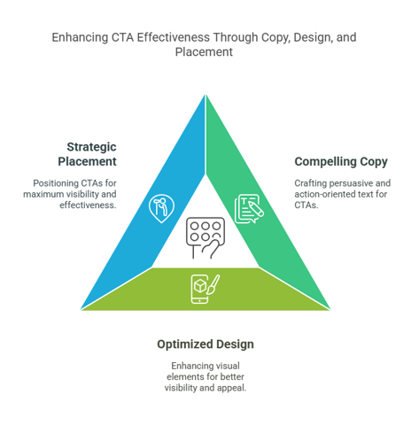
- Colour Contrast: Use contrasting colors to make the CTA stand out from the surrounding content1718.
- Button Size and Shape: Ensure the button is large enough to be easily noticed and tappable, especially on mobile devices. Experiment with different shapes to see what works best. Use familiar shapes like rectangles with sharp or rounded corners to ensure the CTA is easily recognizable as a clickable element1718.
- Whitespace: Use whitespace around the CTA to make it more prominent and reduce visual clutter1719.
- Visual Cues: Use elements like arrows, icons, or animations to draw attention to the CTA19.
- Font Size and Readability: Select a clean, legible font for your CTA, and avoid overly decorative fonts that can be difficult to read. Ensure the font size is large enough to be easily read on different devices13.
3. STRATEGIC CTA PLACEMENT
- Above the Fold: Place important CTAs above the fold, where they are immediately visible to users1718.
- End of Content: Position CTAs at the end of compelling content to capitalize on user engagement4.
- Multiple Placements: Don't rely on just one placement. Experiment with different locations throughout your website or email20.
- Contextual Relevance: Ensure the CTA aligns with the surrounding content and user intent19.
CASE STUDIES AND EXAMPLES
Several case studies highlight the impact of effective CTA strategies:
Wording:
- Madison Miles Media: Changing the CTA copy from "Free Marketing Assessment" to "Let's Connect" resulted in a 225% improvement in conversion rate. The Madison Miles Media case study demonstrates the significant impact that even subtle changes in CTA wording can have on conversion rates21.
Placement and Design:
- Archive Social: Moving the primary CTA to a prominent position above the fold and using contrasting colors increased CTR by 101%22.
- Open Mile: Reducing clutter around the CTA increased conversion rate by 232%22.
Addressing User Concerns:
- Nomad Cooks: Addressing doubt alongside the CTA increased conversions by 124%22.
Email Marketing:
- Social Times: Adding social media sharing buttons to emails resulted in a 158% increase in click-through rate (CTR)22.
CONCLUSION
Modern CTA strategy involves a holistic approach that considers copy, design, placement, and the use of AI and personalisation. By implementing the best practices outlined in this report and continuously testing and optimising your CTAs, you can significantly improve your conversion rates and drive business growth in 2025 and beyond. Start optimising your CTAs today and see the difference it can make in your conversion rates!

Frequently Asked Questions: Modern CTA Strategy 2025
How Many CTAs Should I Have on a Single Webpage?
While there's no one-size-fits-all answer, research shows that having multiple strategic CTAs can increase conversion opportunities. The key is to avoid overwhelming users. For most pages, focus on 1-2 primary CTAs per section, with a clear hierarchy of importance. HubSpot's research indicates that pages with focused, contextual CTAs typically perform better than those cluttered with multiple competing calls to action.
Does AI-powered CTA Optimization Work for Small Businesses?
Absolutely! With platforms like HubSpot offering smart CTA features, businesses of all sizes can leverage AI for CTA optimization. Start with basic personalisation (like showing different CTAs to new vs. returning visitors) and gradually expand as you gather more data. The key is starting with clear goals and measuring results consistently.
How Do I Create Effective CTAs for Different Stages of the Buyer's Journey?
Align your CTA messaging with where prospects are in their journey. For awareness stage prospects, focus on educational CTAs like "Learn More About [Topic]" or "Download Free Guide." During the consideration stage, use CTAs like "Compare Solutions" or "Watch Demo." For decision-stage prospects, implement action-oriented CTAs such as "Start Free Trial" or "Book Consultation." Remember to use HubSpot's lifecycle stage targeting to deliver the right message at the right time.
What's the Impact of Dark Mode on CTA Design?
With dark mode adoption growing, ensuring your CTAs maintain visibility and contrast in both light and dark environments is crucial. Test your colour combinations in both modes, and consider using CSS media queries to adapt CTA styling automatically. This is especially important for email CTAs, where dark mode usage is particularly high.
How Do You Measure CTA Success Beyond Click-through Rates?
Success measurement should go beyond simple click-through rates. Focus on conversion rate by CTA placement, time to click, subsequent page engagement, revenue attribution, and mobile vs. desktop performance. Tools like HubSpot Analytics can help track these metrics and attribute them to specific CTAs, giving you a complete picture of CTA effectiveness.
What About Voice-activated CTAs? Are They the Future?
Voice-activated CTAs are emerging as voice commerce grows. While still in early stages, consider incorporating voice-friendly phrases in your CTAs (e.g., "Ask about our service" instead of just "Learn More"). Industry predictions suggest voice interactions will become more prominent by 2026.
Do CTAs Need to Be Buttons, or Can They Be Text Links?
Both can be effective when used strategically. Button CTAs typically work best for primary actions, while text links can be effective for secondary CTAs or in-content calls to action. The key is maintaining clear visual hierarchy and ensuring accessibility standards are met for both types.
How Often Should I Update My CTAs?
Review CTA performance monthly and conduct A/B tests quarterly. However, if you're using AI-powered dynamic CTAs, the optimization happens automatically. Keep an eye on industry trends and user behavior patterns to inform larger strategic updates.
Pro Tip: Remember that the most effective CTAs are those that align with your overall inbound marketing strategy and provide clear value to your visitors. Use these insights as guidelines, but always test what works best for your specific audience.
Need help implementing these strategies? Book a consultation with our team to discuss your specific CTA optimisation needs!
WORKS CITED
- Top Customer Engagement Strategies for 2025 | SAP Emarsys, accessed on February 13, 2025, https://emarsys.com/learn/blog/top-customer-engagement-strategies/
- Conversions in 2025: 150+ Stats You Need to Know - Thrive Themes, accessed on February 13, 2025, https://thrivethemes.com/conversion-rate-optimization-stats/
- Top 5 Content Marketing Strategies + Trends & Challenges For 2025 - Digital Silk, accessed on February 13, 2025, https://www.digitalsilk.com/digital-trends/content-marketing-strategies/
- 25 New Call to Action (CTA) Statistics in 2025 - WiserNotify, accessed on February 13, 2025, https://wisernotify.com/blog/call-to-action-stats/
- Contextual CTAs: AI-Powered, Personalized Call-to-Actions - Wisp CMS, accessed on February 13, 2025, https://www.wisp.blog/features/contextual-cta
- 7 ways AI can optimize personalized CTAs for enhanced online campaigns, accessed on February 13, 2025, https://online-personalization.solutions/en/7-ways-ai-can-optimize-personalized-ctas-for-enhanced-online-campaigns/
- Evolution Of CTA Buttons Over The Years In Ux Design | by Abhijeet Dange - Medium, accessed on February 13, 2025, https://medium.com/design-bootcamp/evolution-of-cta-buttons-over-the-years-in-ux-design-ea10e6f402a3
- Call-to-Action A/B Testing Techniques Guide - Bliss Drive, accessed on February 13, 2025, https://www.blissdrive.com/cro/call-to-action-ab-testing-techniques-guide/
- The 16 best A/B testing tools and software alternatives to Google Optimize - Unbounce, accessed on February 13, 2025, https://unbounce.com/a-b-testing/best-tools/
- 15 Best A/B Testing Tools in 2025 [Top Alternatives to Google Optimize] - VWO, accessed on February 13, 2025, https://vwo.com/blog/ab-testing-tools/
- 7 Best A/B Testing Tools + Software - Contentsquare, accessed on February 13, 2025, https://contentsquare.com/guides/ab-testing/tools/
- 11 A/B Testing Tools for 2022 - Amplitude, accessed on February 13, 2025, https://amplitude.com/blog/ab-testing-tools
- Email CTAs: Best Practices & Examples [2025] - Moosend, accessed on February 13, 2025, https://moosend.com/blog/email-cta/
- Guide On Call To Action: All You Need to Know in 2025 - WiserNotify, accessed on February 13, 2025, https://wisernotify.com/blog/call-to-action/
- Best Practices for Optimizing Call To Action Buttons (w. Examples) - Omniconvert, accessed on February 13, 2025, https://www.omniconvert.com/blog/call-to-action-optimization-for-online-conversions/
- The importance of personalized calls-to-action - Abmatic AI, accessed on February 13, 2025, https://abmatic.ai/blog/importance-of-personalized-calls-to-action
- What are the key elements of CTA button design? - Cieden, accessed on February 13, 2025, https://cieden.com/book/atoms/button/key-elements-of-cta-button-design
- The Psychology Behind Successful CTAs: How Placement, Color Choice, and Wording Influence Conversion Rates - Internet agency Munich for TYPO3 and Shopware, accessed on February 13, 2025, https://signundsinn.com/blog-beitrag/The-Psychology-Behind-Successful-CTAs-How-Placement-Color-Choice-and-Wording-Influence-Conversion-Rates/
- Personalized Call to Action: Get More Clicks and Sales (2025) - WiserNotify, accessed on February 13, 2025, https://wisernotify.com/blog/personalized-call-to-action/
- How to optimize your call to action for conversions - Abmatic AI, accessed on February 13, 2025, https://abmatic.ai/blog/how-to-optimize-call-to-action-for-conversions
- How Does Language Affect Conversion Rates? Here Are the Awesome Results of Our CTA A/B Test. - Digital Marketing Agency, accessed on February 13, 2025, https://madisonmilesmedia.com/blog/how-does-language-affect-conversion-rates-here-are-the-awesome-results-of-our-cta-a-b-test/
- 2025 Call-to-Action Statistics Proving the Power of CTAs in Marketing, accessed on February 13, 2025, https://www.protocol80.com/blog/cta-statistics
More inbound marketing contents...
- The Content Marketing Blog: Benefits of Blogging for Business and Marketing
- Inbound Marketing Website Design: What The Internet Looks Like In 2016
- Inbound Marketing: ATTRACT - Social Publishing
- Inbound Marketing: CONVERT - Forms