MASTERING THE ART OF CREATING A COMPELLING CALL TO ACTION ON HUBSPOT
- Home
- MASTERING THE ART OF CREATING A COMPELLING CALL TO ACTION ON HUBSPOT
As a marketing manager in the fast-paced technology sector, you recognise the power of guiding your prospects effectively through their buyer's journey. Among various tactics, Calls-to-Action (CTAs) stand out as one of the most potent strategies to steer the course of this journey. Whether it's an email opened by a prospect or a visitor exploring your website, each interaction offers a golden chance to influence their next step, gather valuable insights about them or progress the conversion process.

Maybe your visitors are on your site eager to connect with a sales representative, subscribe to your enlightening blog, download a knowledge-packed eBook, or perhaps, make a purchase. How do you subtly encourage these actions? The answer lies in crafting a clear, compelling Call-to-Action (CTA) - an irresistible button that not only promotes a specific action but also leads to a dedicated landing page.
STRATEGIES FOR DESIGNING A WINNING CTA
1. Emphasize Action: In an era of information overload, your audience often lacks the luxury of time to ponder their next step. Be their guide. Use clear, action-driven language like "Download the eBook" or "Buy Now".
2. Conciseness is Key: In your CTA, brevity is not just the soul of wit, but also of effectiveness. Keep your message succinct.
3. Be Transparent: Let your audience know exactly what they're getting. Include specific keywords to clarify your offer. For instance, rather than a vague "Download it", opt for "Download the SEO guide".
4. Demand Attention: Ensure your CTA is eye-catching, with a copy that entices visitors to click. Employ A/B testing to discover the colour scheme or text that resonates most with your prospects.
5. Strategic Placement: Place your CTA where it complements the overall design of the page, ideally within the first fold of your website. Remember, the location of your CTA is as crucial as its message.
6. Analyze and Optimize: Keep a close eye on your CTA's performance metrics, particularly the click-through rate and the click-to-submissions goal. These insights will help you fine-tune your approach and boost the effectiveness of your CTAs.
By mastering these tactics, you'll be well on your way to crafting CTAs that not only capture attention but also propel your prospects smoothly through their buyer's journey. Remember, a compelling CTA is more than a button; it's a gateway to conversion.
How to create a CTA on HubSpot.
If you're using HubSpot, it is very simple to build an efficient CTA. Here is the procedure, step by step.
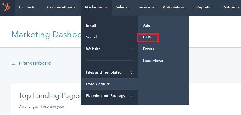
1. Enter the platform and click "Marketing" -> "Lead Capture" -> "CTAs" on the top bar.

2. Click on "Create CTA".

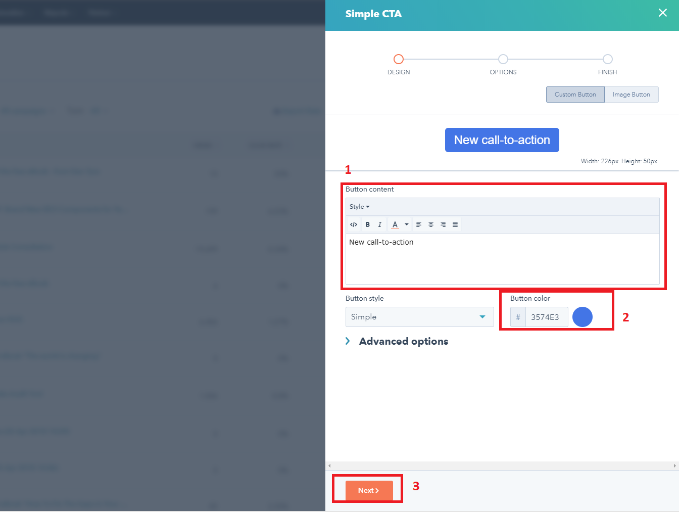
3. Type the text of the call-to-action, choose a colour for the button and go ahead.

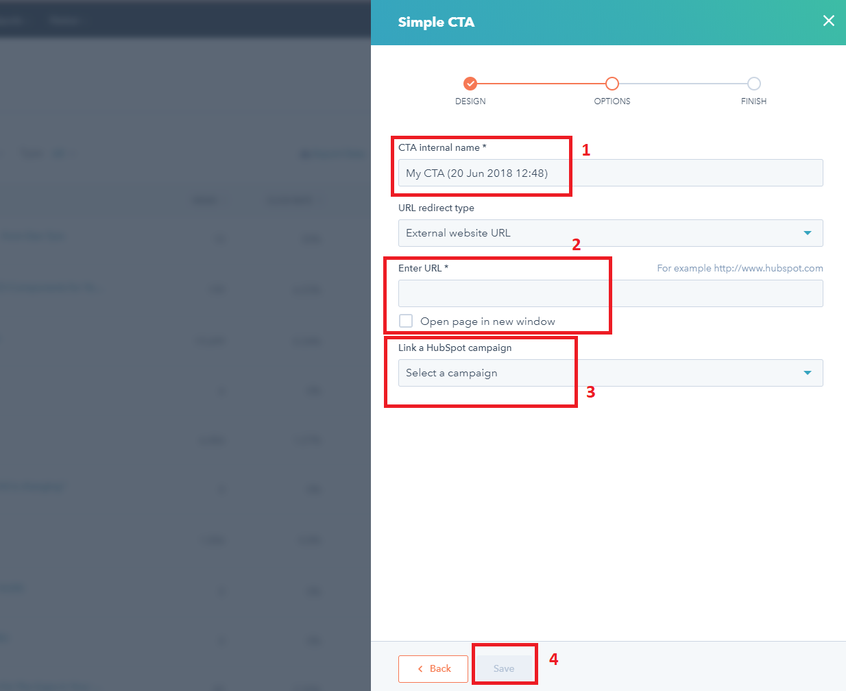
4. Choose an internal name (it will be not visible to the users), link it to a landing page, select the campaign in which your CTA must be and save.

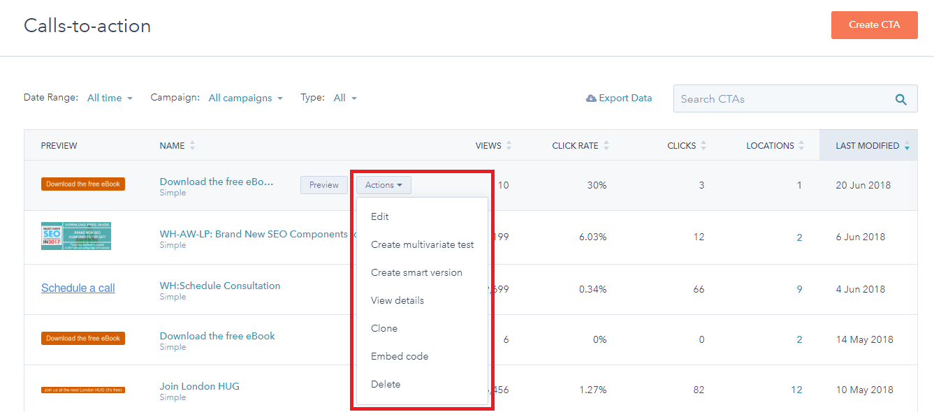
5. Now that your CTA exists, you can run an A/B test or an MVT, insert the call-to-action into your website and view the insights.

That's it! You have just created your perfect call to action!
Frequently Asked Questions about Creating a Compelling Call to Action (CTA)
1. What is a Call to Action (CTA)?
A Call to Action (CTA) is a marketing term referring to any prompt, usually, a button or a link, that encourages a website visitor or email recipient to take some specific action, such as downloading a guide, signing up for a newsletter, or making a purchase.
2. Why is a CTA important?
CTAs are crucial because they guide your audience towards the next step in the buyer's journey. By implementing a clear and compelling CTA, you can encourage a desired action, increasing your engagement, conversion rates, and ultimately, your ROI.
3. What should a good CTA include?
A good CTA should be action-oriented, concise, and clear about what the offer is. It should grab attention and be strategically placed on the page for maximum visibility.
4. What does 'action-oriented' mean in terms of a CTA?
An action-oriented CTA means that the language used directly prompts the visitor to take a specific action. This can be phrases like "Download Now," "Register Today," or "Buy Now".
5. How do I make my CTA attention-grabbing?
A CTA can be made attention-grabbing by using vibrant colours, and compelling language, and by placing it strategically on the page. It can also be beneficial to run A/B tests to determine which version of a CTA is more effective.
6. Where should I place my CTA?
While there's no fixed rule, it's generally effective to place your CTA within the first fold of your website or near the content that's relevant to the CTA's offer. The key is to ensure it's visible and natural within the context of your page.
7. How do I measure the success of my CTA?
The success of a CTA can be measured using metrics like click-through rates and conversion rates. These can be tracked through various analytics tools. Regularly analyzing these metrics can help you optimize your CTA for better performance.
8. What is A/B testing in terms of CTAs?
A/B testing involves creating two versions of a CTA with varying elements like colour, text, or placement and then showing them to different segments of your audience to see which version performs better. This can provide valuable insights for optimizing your CTAs.
Need help? Contact us through:
Phone: +44 20 8834 4795
Email: clwyd@whitehat-seo.co.uk
Related Article:

