Inbound Marketing & The Attract Stage, A Responsive Growth Driven Website Design
We’re now more than halfway through our journey looking at the first ‘Attract’ segment of inbound marketing. Today we’re going to be looking at pages, or more specifically, how to make your website pages work for you, especially when it comes to your inbound marketing website design using a Growth Driven Design methodology.
If you’re looking to buy a product or service, where’s the first place you look for options? Go back a few years and it probably would have been thumbing through the physical Yellow Pages directory or maybe you’d ask a friend. In a very short period of time, both of these things have effectively been replaced by an online connection.
The Yellow Pages is now predominantly a website and the online equivalent of asking a friend would probably be to go to one of the numerous customer review websites. It’s almost second nature to us now, and yet, more than half of small businesses in the UK don’t have a website at all. In this technology-driven culture, having a business without a website could be costing you real business, but there’s more.
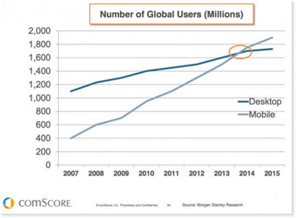 In 2014, there was a tipping point on the internet. It may not have made the news, but it was an important piece of digital marketing history. For the first time ever, the number of users using a mobile device to surf the web surpassed those using a desktop device. It may not come as a big surprise for those of you in the industry, but it was a game changer.
As the desktop computer market stagnates, mobile internet is growing fast. With the rise of increasingly advanced smartphones and portable tablet devices coupled with better, faster, more widespread mobile network coverage, people are going online whilst they’re on the move, more than ever before. Even if you do have a website, having one that isn’t responsive to this change means you’re already getting left behind.
Because of how you navigate around a website, the way it is displayed on your device of choice affects your experience whilst using it. On a desktop or laptop, you’ll probably be using a mouse or trackpad to move around. Whereas, on a smartphone or tablet, touch will be the overriding user interface. This affects how you move and navigate throughout the website. When you visit a company’s website or individual blog, the host of the site knows what kind of device you’re using to view it. Because it understands the nature of this device, the website design will adjust to ensure you get the very best user experience. This is called mobile responsiveness. The site optimises itself to the user automatically to give them the best experience at that time.
Making your website site adaptable to offer the most appealing face of your company will go a long way in encouraging people to visit. Not just once, but time and time again. They’ll know they’re always going to get a great experience. Once they know that, they’ll have no hesitation in sticking around to see what else you have to offer. Your website becomes a hospitable host and an enticing place to be.
 Now your website is up and running, responsive to the customer’s needs, the next step is some amazing content. We’ve talked a little about SEO to get them there and about blogs to keep them there in previous posts, but what you can also do to ensure you’re attracting the right visitors is create an amazing landing page.
A landing page is often the first page a visitor will see when they come to your website and they fulfil a number of important roles. Firstly, they give people exactly what they’re looking for and can offer them exactly what they need immediately. Right there, front and centre.
 When it comes to inbound marketing and attracting visitors, a landing page is a great way to be able to analyse your progress, as it will be the primary destination for those visitors. It’s also a great place to include many of the keywords your potential customers are looking for, which ultimately helps your search engine optimisation.
Use a landing page to offer customers ‘something’ straight away; whether it’s a free eBook or the ability to subscribe to your newsletter, anything that will lead them by the hand, deeper into your site. The last thing you want is a high bounce rate; customers who simply look at one page then go surfing somewhere else.
Reference
Other Content You May Find Interesting
- The Content Marketing Blog: Benefits of Blogging for Business and Marketing
- Inbound Marketing SEO As A Way To Attract New Visitors & Leads
- What is Growth Driven Design
CONCLUSION
By now you may well be looking at your own website with a new set of eyes. Is it responsive? Is it adaptable? Does it have a landing page? If you need help with any of these things, the team here at the Whitehat inbound marketing agency can help you. It’s just one part of a bigger picture that you need to see and it’s all part of our inbound marketing service which we’d be delighted to talk to you more about.